darktable preset inspired by KodakPortra 400
Soft and pastel, with warm skin tones that stay natural.
- Film
- GA — 004 · sheet, datasheet, sources
- Pack
- Full pack
- darktable
- 5.6 or later
- In darktable
- Styles › Pellicules › Couleur
- File
- Pellicules - Couleur - Kodak Portra 400.dtstyle
A darktable 5.6 style built from the Kodak Portra 400 datasheet: native modules, no LUT, measured on real RAW files. In the full pack.
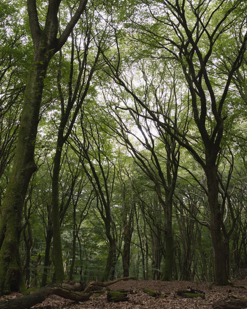
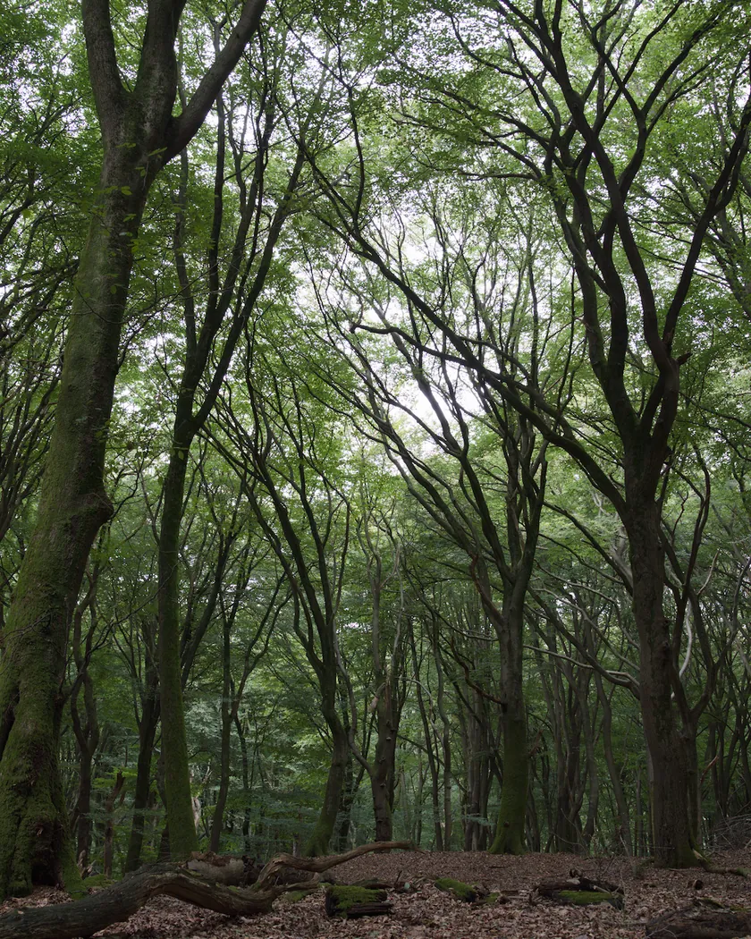
Translation into darktable
| Module | Role | Settings |
|---|---|---|
| rgb primaries | Greens turned slightly toward yellow, skies a little less pure | Green hue −0.05 rad, red hue +0.02 rad, blue purity 0.96 |
| color balance rgb (instance “film”) | Slight warmth, blue-green shadows, pastel highlights | Midtones 50° / 0.008, shadows 165° / 0.02, highlights 45° / 0.02; highlight saturation −10 %, vibrance +0.05 |
| tone curve (RGB, linked channels) | A long, soft curve: blacks barely lifted, midtones slightly brighter, no marked shoulder | Nodes (0, 0.025) (0.10, 0.095) (0.25, 0.25) (0.5, 0.52) (0.75, 0.77) (0.9, 0.905) (1, 0.975) |
| grain | Sized from the Print Grain Index of 37: fine but present | Coarseness 1200, strength 14, midtones bias 90 |
Measurements
The measurements come from a few test photos of our own, which are not published on this site. The photos shown here are different.
| Photo | Zone | Baseline | Metric | Before | After | Film expectation |
|---|---|---|---|---|---|---|
| 0775 | whole image | Base rendering | L (mean lightness) | 53.2 | 55.1 | No specific target |
| 0775 | whole image | Base rendering | Lsd (contrast) | 14.3 | 14.9 | Low to medium contrast: almost unchanged |
| 1014 | whole image | Base rendering | L5 (blacks) | 2.6 | 4.2 | Soft shadows: blacks slightly raised |
| 0775 | sky | Base rendering | C (chroma) | 27.5 | 22.4 | Soft blues: about 18 % less saturated |
| 0775 | sea | Base rendering | C (chroma) | 22.2 | 18.4 | Soft blues: less saturated |
| 0989 | skin | Base rendering | C (chroma) | 16.4 | 17.4 | Natural skin: barely more saturated |
| 0989 | skin | Base rendering | h (hue, °) | 44.2 | 48.3 | Warm skin: about 4° warmer |
| 1014 | pink T-shirt | Base rendering | C (chroma) | 33.7 | 32.6 | Restrained saturation |
Base rendering: darktable’s default processing of the RAW file, without the preset. Luminance conversion (black and white): the same photo converted with plain luminance weights, to isolate the effect of the film’s spectral sensitivity.
What the style changes
The style sets four darktable modules. It aims at a restrained Portra 400: soft contrast, warm but natural skin, calm blues and fine grain, as the datasheet and the reviews describe on the Kodak Portra 400 film page. All figures below come from renders made with darktable-cli 5.6.0 at 1000 px, measured in CIELab.
- A long, soft tone curve. The curve barely lifts the blacks, brightens the midtones slightly and pulls the white point down a little, with no marked shoulder. Contrast hardly moves (Lsd 14.3 → 14.9), while the darkest 5 % of the frame rise from L 2.6 to 4.2. The curve acts on each channel without color preservation, so saturation follows contrast as it does on film. Its nodes are in perceptual lightness: 0.5 is about middle gray.
- Softer blues. rgb primaries lowers the purity of blue and turns greens slightly toward yellow. Sky chroma drops from 27.5 to 22.4, sea chroma from 22.2 to 18.4.
- Warm skin, blue-green shadows. A color balance rgb instance named “film” adds a faint warm tint to the midtones and highlights and a blue-green tint to the shadows. It also lowers highlight saturation by 10 % and adds a touch of vibrance. Skin hue moves from 44.2° to 48.3°, and skin chroma only from 16.4 to 17.4.
- Fine grain, sized from Kodak’s Print Grain Index of 37 for a 4×6 print from 35 mm.
For comparison, the t3mujinpack Portra 400 style, rendered on the same files, lightens the image clearly (L 58.3 on photo 0775) and saturates skin by about 40 % (C 23.1 against 16.4 before). We read it as the look of overexposed Portra on a Frontier scan. This style aims at a quieter Portra.
What it leaves alone
- Your base development. The style contains no exposure, no sigmoid or filmic, no white balance and no LUT. Those settings stay as you made them.
- Your color balance rgb. The style’s color balance rgb is a separate instance named “film”: it is added next to yours, which stays untouched.
- But not your tone curve, rgb primaries or grain. When you apply a style from the lighttable or the darkroom, each of its modules replaces the instance of the same module with the same name, if the photo has one, and is added otherwise. The style’s tone curve, rgb primaries and grain carry no instance name, so they replace any settings you had already made in those three modules. Your earlier settings remain in the history.
- Your pipeline order. The style file carries no module order list, so it does not impose one on your image.
Exporting with a style, or rendering with darktable-cli, works differently: every module of the style is added as a separate instance. Our measurements were made that way, on darktable’s default rendering. The details are in Install and apply darktable styles.
Limits
- An interpretation, not a calibration. The style is built from Kodak’s datasheet and published reviews. No film was scanned or measured to tune it. Real Portra 400 also changes with exposure, development and, above all, the scanner.
- Sky hue. Whether Portra skies lean cyan or violet is not reliably documented, so the style leaves sky hue almost neutral.
- Overexposure. The pastel look of overexposed Portra comes from the film’s non-linear response to extra light. A style cannot reproduce it.
- Subtle by design. On some images, the difference from darktable’s default rendering is small.
Tips
- For the pastel look, overexpose slightly with the exposure module.
- Apply it early. If you plan to fine-tune the tone curve, rgb primaries or grain yourself, apply the style first: it would replace those settings if you made them before.
- Everything stays editable. Each module the style sets is an ordinary module instance: you can adjust it or switch it off afterwards, for example the grain strength or the “film” color balance rgb.
- Installation: see Install and apply darktable styles.
Get the preset
GA — 004 / P · darktable preset
Portra 400
for darktable