darktable preset inspired by LomographyColor Negative 400
Firm contrast, fuller blues and greens, a light warm cast and visible grain, between vivid and muted.
- Film
- GA — 037 · sheet, datasheet, sources
- Pack
- Full pack
- darktable
- 5.6 or later
- In darktable
- Styles › Pellicules › Couleur
- File
- Pellicules - Couleur - Lomography Color Negative 400.dtstyle
A darktable 5.6 style inspired by Lomography Color Negative 400: firm contrast, fuller blues and greens, a light warm cast, visible grain. In the full pack.
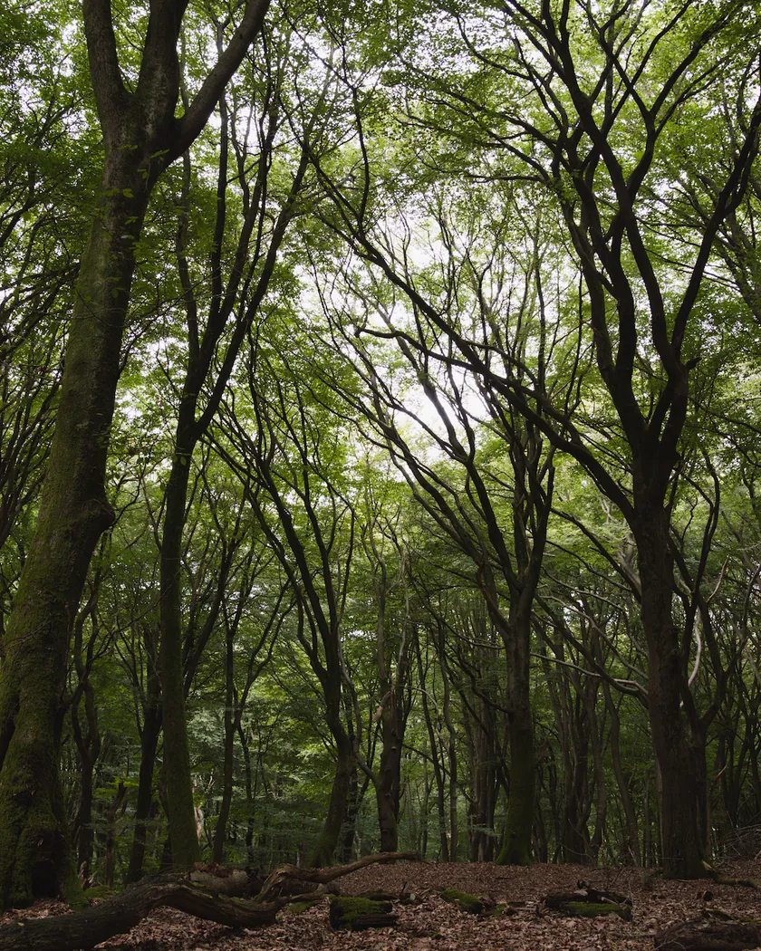
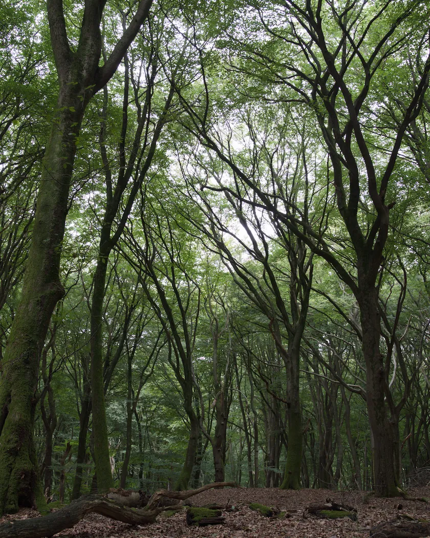
Translation into darktable
| Module | Role | Settings |
|---|---|---|
| rgb primaries | Retro palette: greens slightly yellower, blues toward cyan | Green hue −0.04 rad, blue hue −0.04 rad, red hue +0.02 rad |
| color balance rgb (instance “film”) | Light brownish veil, blue-green shadows | Midtones 50° / 0.010, highlights 70° / 0.012, shadows 200° / 0.012; vibrance +0.05 |
| color equalizer | Fuller blues and greens, restrained skin | Blue saturation ×1.12, green ×1.08, orange ×0.92 |
| tone curve (RGB, per channel) | Firm contrast, slightly lifted blacks, soft shoulder | Nodes (0, 0.03) (0.10, 0.075) (0.25, 0.21) (0.5, 0.505) (0.75, 0.80) (0.90, 0.925) (1, 0.975) |
| grain | Visible grain; no manufacturer figure exists, so it is set close to consumer ISO 400 films | Coarseness 1700, strength 22, midtones bias 80 |
Measurements
The measurements come from a few test photos of our own, which are not published on this site. The photos shown here are different.
| Photo | Zone | Baseline | Metric | Before | After | Film expectation |
|---|---|---|---|---|---|---|
| 1014 | whole image | Base rendering | Lsd (contrast) | 30.7 | 32.7 | Firm contrast: higher |
| 1014 | whole image | Base rendering | L5 (blacks) | 2.6 | 4.0 | Detailed shadows: blacks slightly raised |
| 0775 | whole image | Base rendering | Lsd (contrast) | 14.3 | 17.0 | Firm contrast: higher |
| 0775 | whole image | Base rendering | C (chroma) | 21.4 | 23.5 | Saturation close to the base rendering |
| 0775 | sky | Base rendering | C (chroma) | 27.5 | 31.0 | Fuller blues |
| 0775 | sky | Base rendering | h (hue, °) | 273.6 | 271.5 | Blues toward cyan: slight shift |
| 0775 | sea | Base rendering | C (chroma) | 22.2 | 24.9 | Fuller blues |
| 0989 | skin | Base rendering | L (lightness) | 78.2 | 81.7 | No specific target |
| 0989 | skin | Base rendering | C (chroma) | 16.4 | 17.9 | Restrained skin saturation |
| 0989 | skin | Base rendering | h (hue, °) | 44.2 | 52.6 | Light warm veil: skin toward orange |
| 1014 | pink T-shirt | Base rendering | C (chroma) | 33.7 | 38.6 | Fuller colors |
| 1014 | pink T-shirt | Base rendering | h (hue, °) | 358.8 | 8.7 | Light warm veil: toward orange |
Base rendering: darktable’s default processing of the RAW file, without the preset. Luminance conversion (black and white): the same photo converted with plain luminance weights, to isolate the effect of the film’s spectral sensitivity.
What the style changes
The style sets five darktable modules. It aims at a compromise between the two camps of reviews described on the Lomography Color Negative 400 film page: neither the “vivid and bold” reading nor the “muted, brownish” one. Saturation stays close to darktable’s base rendering, blues and greens are slightly fuller, and a light warm-brownish veil sits over midtones and highlights. The figures below come from renders made with darktable-cli 5.6.0, measured in CIELab.
- Firmer contrast, lifted blacks. The RGB tone curve raises contrast (Lsd 30.7 → 32.7 on photo 1014, 14.3 → 17.0 on photo 0775) and lifts the darkest 5 % of the frame from L 2.6 to 4.0, with a soft shoulder.
- Fuller blues. rgb primaries turns blues toward cyan and greens toward yellow, and color equalizer raises blue saturation by 12 % and green by 8 %. Sky chroma goes from 27.5 to 31.0 and sea chroma from 22.2 to 24.9. Sky hue moves from 273.6° to 271.5°.
- A light warm veil. A color balance rgb instance named “film” adds a faint warm tint to midtones and highlights and a blue-green tint to the shadows. Skin hue moves from 44.2° to 52.6° and the pink T-shirt from 358.8° to 8.7°. Skin saturation stays restrained, from C 16.4 to 17.9, because color equalizer lowers oranges by 8 %.
- Visible grain. Lomography publishes no grain figure, so the setting is close to that of consumer ISO 400 films rather than derived from a measurement.
Next to our Kodak Gold 200 style rendered on the same files, this one is less warm and less saturated: skin chroma is 17.9, against 33.4 for the Gold style. Skin hue moves by +8° to +10°, against +12° to +19° for Gold. That is intended.
What it leaves alone
- Your base development. The style contains no exposure, no sigmoid or filmic, no white balance and no LUT. Those settings stay as you made them.
- Your color balance rgb. The style’s color balance rgb is a separate instance named “film”: it is added next to yours, which stays untouched.
- But not your tone curve, rgb primaries, color equalizer or grain. When you apply a style from the lighttable or the darkroom, each of its modules replaces the instance of the same module with the same name, if the photo has one, and is added otherwise. The style’s tone curve, rgb primaries, color equalizer and grain carry no instance name, so they replace any settings you had already made in those modules. Your earlier settings remain in the history.
- Your pipeline order. The style file carries no module order list, so it does not impose one on your image.
Exporting with a style, or rendering with darktable-cli, works differently: every module of the style is added as a separate instance. Our measurements were made that way, on darktable’s default rendering. The details are in Install and apply darktable styles.
Limits
- No datasheet. Lomography publishes no technical data we could obtain, so everything rests on reviews that disagree: vivid against muted.
- A compromise, not a calibration. The style takes a middle path between those camps. It is an interpretation, and no real film was scanned or measured to tune it. The measurements above check the direction of the changes, not fidelity to film.
- Thin evidence. The brownish veil and the fuller blues and greens each come from a single review (Emulsive, and Analogue Wonderland’s customer reviews).
- Uncertain emulsion. The film’s origin is unconfirmed and may vary between lots and years, so the style can only represent an average look.
- Grain not quantified. The grain setting has no manufacturer figure behind it.
Tips
- Tone it down or up. Lower the “film” color balance rgb or the color equalizer if you prefer the muted reading, or raise them for the vivid one.
- Apply it early. If you plan to fine-tune the tone curve, rgb primaries, color equalizer or grain yourself, apply the style first: it would replace those settings if you made them before.
- Everything stays editable. Each module the style sets is an ordinary module instance: you can adjust it or switch it off afterwards, for example the grain strength.
- Installation: see Install and apply darktable styles.
Get the preset
GA — 037 / P · darktable preset
Color Negative 400
for darktable