darktable preset inspired by KodakGold 200
Warm and golden, with grain you notice without it taking over.
- Film
- GA — 008 · sheet, datasheet, sources
- Pack
- Full pack
- darktable
- 5.6 or later
- In darktable
- Styles › Pellicules › Couleur
- File
- Pellicules - Couleur - Kodak Gold 200.dtstyle
A darktable 5.6 style built from the Kodak Gold 200 datasheet: native modules, no LUT, measured on real RAW files. In the full pack.
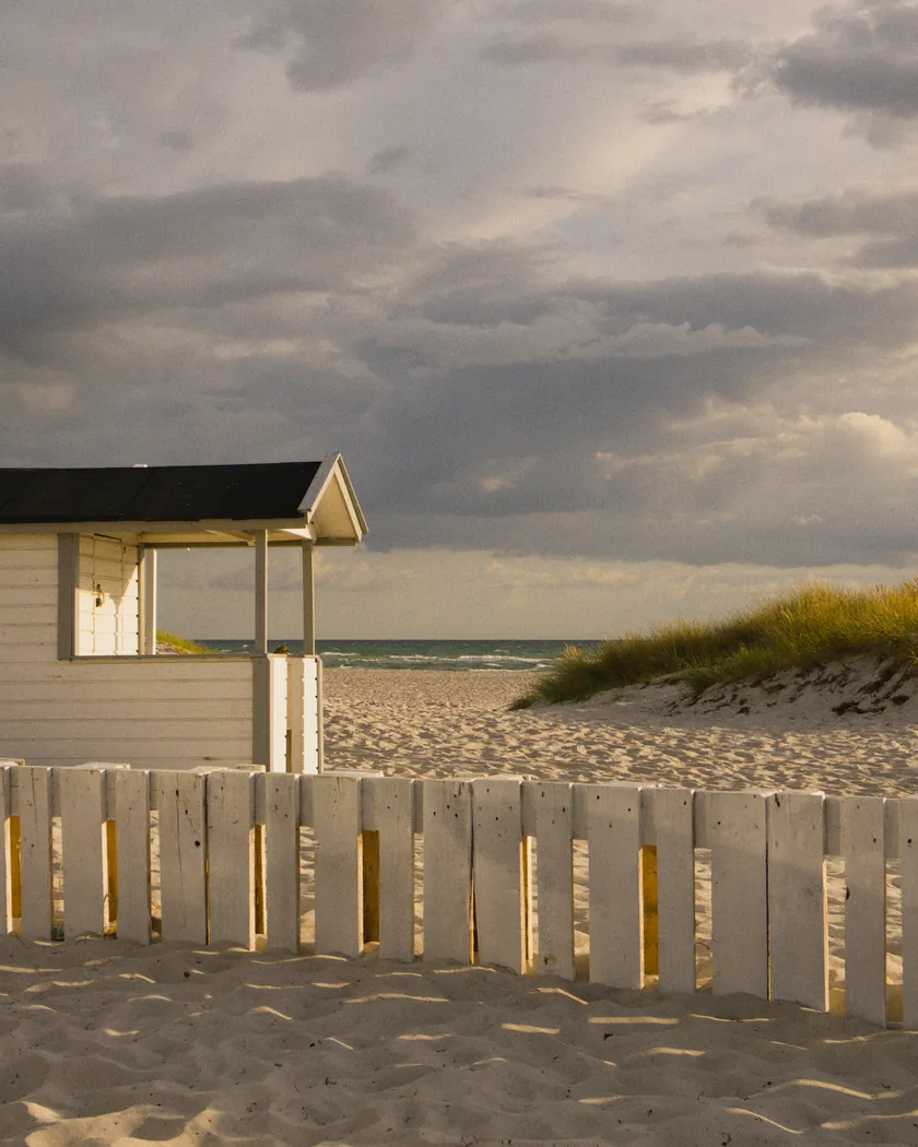
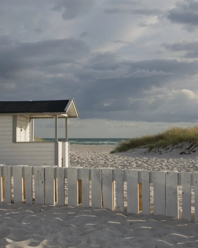
Translation into darktable
| Module | Role | Settings |
|---|---|---|
| rgb primaries | Greens toward yellow, reds toward orange, blues slightly toward cyan | Green hue −0.07 rad, red hue +0.04 rad, blue hue −0.03 rad |
| color balance rgb (instance “film”) | Amber cast in the midtones, warm highlights, slightly blue shadows; more saturation | Midtones 60° / 0.015, highlights 55° / 0.025, shadows 175° / 0.015; saturation +8 %, vibrance +0.10 |
| color equalizer | Vivid yellows and oranges | Saturation: yellow ×1.15, orange ×1.10; brightness: yellow ×1.05 |
| tone curve (RGB, linked channels) | Medium contrast, with a shoulder that compresses the highlights | Nodes (0, 0.02) (0.10, 0.07) (0.25, 0.215) (0.5, 0.505) (0.75, 0.795) (0.88, 0.905) (1, 0.96) |
| grain | Sized from the Print Grain Index of 44: more visible than the Portra 400 style | Coarseness 1600, strength 20, midtones bias 85 |
Measurements
The measurements come from a few test photos of our own, which are not published on this site. The photos shown here are different.
| Photo | Zone | Baseline | Metric | Before | After | Film expectation |
|---|---|---|---|---|---|---|
| 0775 | whole image | Base rendering | Lsd (contrast) | 14.3 | 16.8 | More contrast than the Portra styles |
| 1014 | whole image | Base rendering | Lsd (contrast) | 30.7 | 32.6 | More contrast than the Portra styles |
| 0775 | sky | Base rendering | C (chroma) | 27.5 | 25.2 | Blues slightly less saturated |
| 0775 | sea | Base rendering | C (chroma) | 22.2 | 18.2 | Blues slightly less saturated |
| 0989 | skin | Base rendering | C (chroma) | 16.4 | 25.7 | Warm, saturated skin (our interpretation) |
| 0989 | skin | Base rendering | h (hue, °) | 44.2 | 56.7 | Skin toward yellow-orange |
| 1014 | pink T-shirt | Base rendering | C (chroma) | 33.7 | 41.9 | Reds that pop |
| 1014 | pink T-shirt | Base rendering | h (hue, °) | 358.8 | 18.2 | Reds toward orange |
Base rendering: darktable’s default processing of the RAW file, without the preset. Luminance conversion (black and white): the same photo converted with plain luminance weights, to isolate the effect of the film’s spectral sensitivity.
What the style changes
The style contains five darktable modules. It aims at the warm, golden Gold 200 described on the Kodak Gold 200 film page: an amber cast, reds and oranges that pop, highlights that compress and visible grain. All figures below come from renders made with darktable-cli 5.6.0 at 1000 px, measured in CIELab.
- More contrast, with a shoulder. Unlike the Portra styles, the tone curve bends in the highlights, as the datasheet curve does from about 3.5 to 4 stops above middle gray. Contrast rises by about 2 to 2.5 (Lsd 14.3 → 16.8 and 30.7 → 32.6).
- An amber cast. The “film” color balance rgb warms the midtones and, more strongly, the highlights, and adds a light blue tint to the shadows. Skin hue moves from 44.2° to 56.7°: exactly the direction of the t3mujinpack Gold 200 style (57.6°).
- Reds and oranges that pop, pushed toward orange. rgb primaries turns reds toward orange and greens toward yellow; the color equalizer raises yellows and oranges. The pink T-shirt gains 24 % of chroma and turns 19° toward orange.
- Quieter blues. Sky and sea lose some chroma (−8 % and −18 %). Reviews disagree on Gold’s blues, crisp for one and weak in dark blues for another; the style takes the second reading.
- Warm, saturated skin. Skin chroma rises by 57 % (16.4 → 25.7). A first version went to +75 %; it was brought down, but the style stays more saturated than t3mujinpack (+16 %).
- Visible grain, sized from Kodak’s Print Grain Index of 44, against 37 for Portra 400.
What it leaves alone
- Your base development. The style contains no exposure, no sigmoid or filmic, no white balance, no color calibration and no LUT, so those settings stay as you set them.
- Your color balance rgb. The style’s instance is named “film”, so it is added next to the color balance rgb you tuned on the photo instead of replacing it.
- Your pipeline order. The style file carries no module order list, so it does not impose one on your image.
- But not your settings in its other modules. When you apply the style from the lighttable or the darkroom, darktable 5.6 replaces an existing instance of the same module: if you had already adjusted rgb primaries, color equalizer, tone curve or grain, the style’s settings take their place. Your earlier settings stay in the history stack. Applying the style at export, or with darktable-cli as in our measurements, adds every module as a separate instance instead. See Install and apply darktable styles for the details.
Limits
- An interpretation, not a calibration. The style is built from Kodak’s datasheet and published reviews. No film was scanned or measured to tune it.
- Skin saturation is our choice. Kodak promises “saturated colors” and reviews describe golden tones, but none measures skin saturation. The +57 % on skin is an interpretation, stronger than t3mujinpack’s.
- Greens and blues. Reviews contradict each other: greens muted or well saturated, blues crisp or weak. The style turns greens toward yellow and quiets the blues.
- Exposure shifts are not simulated. Overexposed Gold turns teal for one test and pink-yellow for another; underexposed, it turns orange or violet. The style applies fixed tints.
- The grain depends on export size: at 1000 px, it is barely visible.
Tips
- For a sunny-day, less golden look, lower the midtones and highlights chroma of the “film” color balance rgb: one review finds real Gold fairly neutral on a sunny day at box speed.
- If skin looks too orange, lower the orange saturation of the style’s color equalizer instance.
- Everything stays editable. Each module the style adds is an ordinary instance: you can adjust it or switch it off afterwards.
- Installation: see Install and apply darktable styles.
Get the preset
GA — 008 / P · darktable preset
Gold 200
for darktable