darktable preset inspired by PolaroidColor 600 / i-Type
Raised blacks, creamy highlights and a warm cast.
- Film
- GA — 025 · sheet, datasheet, sources
- Pack
- Full pack
- darktable
- 5.6 or later
- In darktable
- Styles › Pellicules › Instantané
- File
- Pellicules - Instantané - Polaroid Color.dtstyle
A darktable 5.6 style built from the old Polaroid datasheet and reviews: native modules, no LUT, measured on real RAW files. In the full pack.
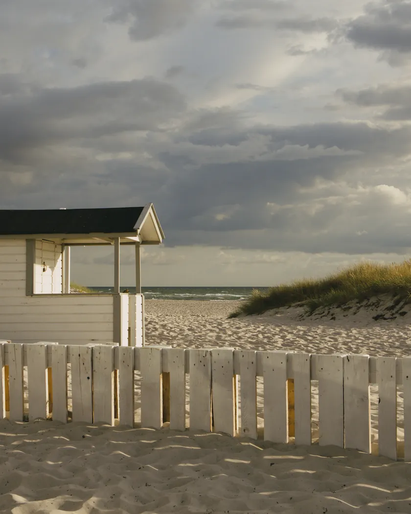
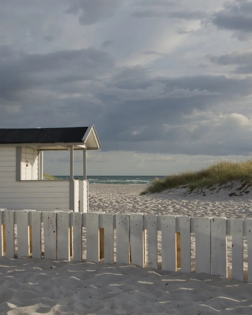
Translation into darktable
| Module | Role | Settings |
|---|---|---|
| rgb primaries | A limited range: greens less pure and pulled toward yellow | Green hue −0.04 rad, green purity 0.88 |
| color balance rgb (instance “film”) | Yellow cast; slightly washed-out highlights | Midtones 70° / 0.02; highlight saturation −5 % |
| color equalizer | Limited range, with blues kept strong under the yellow cast | Saturation: yellow −10 %, green −15 %, cyan −12 %, blue +18 % |
| tone curve (RGB, linked channels) | Steep midtones (slope 1.2): shadows that block up on a raised floor, highlights that stop below white | Nodes (0, 0.07) (0.1, 0.09) (0.22, 0.17) (0.35, 0.32) (0.5, 0.5) (0.65, 0.68) (0.78, 0.83) (0.9, 0.905) (1, 0.93) |
| split-toning | Greenish blacks and pinkish-cream whites, midtones left alone | Shadows: hue 144°, saturation 0.50; highlights: hue 14°, saturation 0.40; balance 0.375, compress 60.5 |
Measurements
The measurements come from a few test photos of our own, which are not published on this site. The photos shown here are different.
| Photo | Zone | Baseline | Metric | Before | After | Film expectation |
|---|---|---|---|---|---|---|
| 0775 | whole image | Base rendering | Lsd (contrast) | 14.3 | 17.1 | Short latitude, high contrast |
| 1014 | whole image | Base rendering | L5 (blacks) | 2.6 | 7.3 | Blocked-up shadows that are not quite black |
| 0989 | white wall | Base rendering | L95 (whites) | 97.9 | 92.4 | Whites below pure white |
| 0989 | white wall | Base rendering | b* | -0.1 | 2.4 | Creamy highlights |
| 1014 | gray T-shirt | Base rendering | b* | -3.7 | 4.6 | Overall yellow bias |
| 0989 | skin | Base rendering | h (hue, °) | 44.2 | 58.3 | Yellower skin |
| 1014 | shadow on the ground | Base rendering | a* | 2.5 | -1.6 | Greenish shadows |
| 1014 | pink T-shirt | Base rendering | C (chroma) | 33.7 | 38.2 | Strong reds |
| 0775 | sky | Base rendering | C (chroma) | 27.5 | 30.2 | Strong blues |
| 0775 | sky | Base rendering | h (hue, °) | 273.6 | 274.0 | Sky hue unchanged |
Base rendering: darktable’s default processing of the RAW file, without the preset. Luminance conversion (black and white): the same photo converted with plain luminance weights, to isolate the effect of the film’s spectral sensitivity.
What the style changes
The style sets five darktable modules. It aims at a Color 600 or i-Type print developed at a normal temperature, between 13 and 28 °C: short latitude, strong midtone contrast, blocked but not black shadows, creamy whites, a yellow cast, and strong reds and blues in a limited range, as reviewers describe on the Polaroid Color film page. No datasheet exists for today’s chemistry: the tone range comes from the pre-2008 Polaroid datasheet, the colors from reviews. All figures below come from renders made with darktable-cli 5.6.0 at 1000 px, measured in CIELab.
- Short, contrasty tone range. The tone curve has a midtone slope of 1.2, against 1.04 in the Portra 400 style. Shadows block up quickly on a raised floor, as the old datasheet’s limited maximum density suggests, and highlights stop below white.
- On the landscape, contrast rises by 20 % (Lsd 14.3 → 17.1).
- Blacks stay above black: L5 of 2.6 → 7.3 on one photo, and a dark vault goes from L 5.1 to 8.0 with little detail left.
- Whites stay below pure white: a white wall goes from L95 97.9 to 92.4.
- Yellow cast, creamy whites. A color balance rgb instance named “film” adds a yellow cast to the midtones. A gray T-shirt goes from b* −3.7 to +4.6, and skin hue from 44° to 58°. The white wall turns slightly cream (a*/b* from −0.1/−0.1 to +2.3/+2.4).
- Greenish shadows, pinkish highlights. split-toning works after the tone curve and only on shadows below a lightness of about 0.10 and highlights above about 0.65, in linear values, so the sky and the sea, in the midtones, are not tinted. A shadow on the ground goes from a* +2.5 to −1.6.
- Strong reds and blues in a limited range. rgb primaries and color equalizer make greens, yellows and cyans less saturated, and raise blue saturation so that blues survive the yellow cast. A pink T-shirt gains 13 % chroma and the sky 10 %, and the sky keeps its hue (273.6° → 274.0°).
- No grain. Reviewers find instant film virtually grainless, so the style adds none.
It differs clearly from the Portra 400 style, which keeps the base contrast, softens blues (sky C 22.4) and leaves whites near 96.
What it leaves alone
- Your base development. The style contains no exposure, no sigmoid or filmic, no white balance and no LUT. Those settings stay as you made them.
- Your color balance rgb. The style’s color balance rgb is a separate instance named “film”: it is added next to yours, which stays untouched.
- But not your rgb primaries, color equalizer, tone curve or split-toning. When you apply a style from the lighttable or the darkroom, each of its modules replaces the instance of the same module with the same name, if the photo has one, and is added otherwise. These four modules carry no instance name, so they replace any settings you had already made in them. Your earlier settings remain in the history.
- Your pipeline order. The style file carries no module order list, so it does not impose one on your image.
Exporting with a style, or rendering with darktable-cli, works differently: every module of the style is added as a separate instance. Our measurements were made that way, on darktable’s default rendering. The details are in Install and apply darktable styles.
Limits
- An interpretation, not a calibration. The only datasheet describes the old Polaroid film, made before 2008 with other dyes; only its tone range is used. The colors come from reviews. No film was scanned or measured to tune the style.
- One print, one temperature. The style represents a print developed at a normal temperature. It does not simulate the variation from one print to the next.
- Conflicting sources. Reviews disagree on contrast (high for most, “soft” for some) and on the color of the highlights (pink or cream). The style follows the majority and takes a pinkish cream.
- The raised black is a compromise between the old datasheet, where a print stops around L* 13, and scans, which often reset the black point.
- Low sharpness is not simulated. darktable’s blurs module imposes a minimum radius, which would blur a small export much more, in proportion, than a large one.
- Light blues lose chroma. A light blue shutter drops from C 33.1 to 25.1: it falls into the highlight zone of the curve and of split-toning. The Portra 400 style does the same.
- The green shadow tint pulls the sea slightly toward cyan (hue 270° → 266°). No source describes that.
- Fixed thresholds. split-toning’s thresholds do not move: a very dark or very bright image takes more or less tint.
- SX-70 film is not covered. It is a different, ASA 160 film, with light purple highlights and navy shadows according to Analog.cafe. Neither the white frame nor the square format is simulated.
Tips
- For a print developed in the cold, cool the white balance and lower the contrast by hand; Polaroid warns that cold film gives a blue tint.
- For a print developed in the heat, warm the white balance toward yellow-red: above 28 °C, Polaroid says prints tend to develop with a yellow/red tint.
- Crop to a square if you want the proportions of the print: the image area of 600 and i-Type film is 79 × 77 mm.
- Apply it early. If you plan to fine-tune the tone curve, rgb primaries, color equalizer or split-toning yourself, apply the style first: it would replace those settings if you made them before.
- Installation: see Install and apply darktable styles.
Get the preset
GA — 025 / P · darktable preset
Color 600 / i-Type
for darktable