darktable preset inspired by FujifilmFP-100C
Discontinued peel-apart instant film: firm contrast, vivid reds, cooler blues, no grain.
- Film
- GA — 075 · sheet, datasheet, sources
- Pack
- Full pack
- darktable
- 5.6 or later
- In darktable
- Styles › Pellicules › Instantané
- File
- Pellicules - Instantané - Fujifilm FP-100C.dtstyle
A darktable 5.6 style for Fujifilm FP-100C peel-apart film: firm contrast, vivid reds, cool blues. Based on few reviews and no datasheet curve.
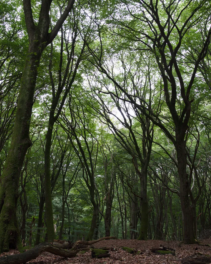
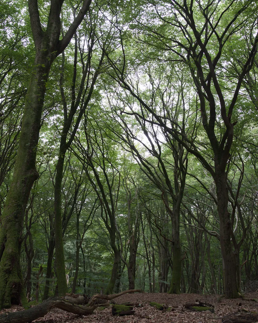
Translation into darktable
| Module | Role | Settings |
|---|---|---|
| rgb primaries | Vivid reds, slightly less vivid greens, blues pulled toward cool (cyan) | Red purity 1.03, green purity 1.01, blue hue −0.03 rad |
| color balance rgb (instance “film”) | Light grays very slightly bluish; candy colors without excess | Highlights 255° / 0.005; global saturation +2 %, vibrance +3 % |
| color equalizer | Reds more vivid than greens | Saturation: red ×1.09, orange ×1.03, yellow ×1.02, green ×1.03, blue ×1.0 |
| tone curve (RGB, per channel) | Firm midtones (slope about 1.2): sustained contrast, short latitude, without the crushed blacks of the Instax style or the raised floor of the Polaroid style | Nodes (0, 0) (0.1, 0.075) (0.22, 0.185) (0.35, 0.33) (0.5, 0.505) (0.65, 0.675) (0.78, 0.82) (0.9, 0.94) (1, 0.995) |
Measurements
The measurements come from a few test photos of our own, which are not published on this site. The photos shown here are different.
| Photo | Zone | Baseline | Metric | Before | After | Film expectation |
|---|---|---|---|---|---|---|
| 0775 | whole image | Base rendering | Lsd (contrast) | 14.3 | 16.3 | Sustained contrast, short latitude (inferred, not read from a curve) |
| 1014 | whole image | Base rendering | Lsd (contrast) | 30.7 | 33.1 | Sustained contrast, short latitude (inferred, not read from a curve) |
| 1013 | vault | Base rendering | L | 5.1 | 3.7 | Deep blacks without abrupt crushing |
| 1014 | white wall | Base rendering | b* | 0.0 | -0.7 | Neutral whites, no cream or pink |
| 1014 | gray T-shirt | Base rendering | b* | -3.7 | -5.1 | Light grays with a slight blue tint |
| 0989 | orange vests | Base rendering | C (chroma) | 37.8 | 49.4 | Vibrant reds |
| 1014 | pink T-shirt | Base rendering | C (chroma) | 33.7 | 40.6 | Vibrant reds |
| 0775 | sky | Base rendering | h (hue, °) | 273.6 | 271.0 | Blues on the cool side |
| 0775 | sea | Base rendering | h (hue, °) | 270.1 | 267.6 | Blues on the cool side |
| 0989 | skin | Base rendering | h (hue, °) | 44.2 | 43.8 | No warm cast |
Base rendering: darktable’s default processing of the RAW file, without the preset. Luminance conversion (black and white): the same photo converted with plain luminance weights, to isolate the effect of the film’s spectral sensitivity.
What the style changes
The style sets four darktable modules. It aims at a normally developed FP-100C print: sustained contrast, vivid reds, greens a little less vivid, cool blues and very slightly bluish light grays, as the few available reviews describe on the Fujifilm FP-100C film page. No datasheet with a characteristic curve was found, so this is an interpretation, not a calibrated emulation. All figures below come from renders made with darktable-cli 5.6.0 at 1000 px, measured in CIELab.
- Firm contrast. The tone curve has a midtone slope of about 1.2. Contrast (Lsd) rises from 14.3 to 16.3 on the landscape and from 30.7 to 33.1 on the scene in full light. A dark vault goes from L 5.1 to 3.7. The values sit between the Polaroid Color and Instax Mini styles, and the contrast level itself is deduced from reviews, not read from a curve.
- Neutral whites. A white wall goes from b* 0.0 to −0.7, without cream or pink. The style’s Polaroid counterpart adds a yellow cast; this one does not.
- Slightly bluish light grays. A gray T-shirt goes from b* −3.7 to −5.1.
- Vivid reds. Orange vests gain 31 % of chroma (37.8 → 49.4) and a pink T-shirt 20 % (33.7 → 40.6).
- Cool blues. The sky hue moves from 273.6° to 271.0° and the sea from 270.1° to 267.6°.
- No warm cast. Skin hue stays at 43.8° (base 44.2°).
- No grain. The film has no silver grain, so the style adds none.
What it leaves alone
- Your base development. The style contains no exposure, no sigmoid or filmic, no white balance and no LUT.
- Your color balance rgb. The style’s color balance rgb is a separate instance named “film”, added next to yours.
- But not your rgb primaries, color equalizer or tone curve. When you apply a style from the lighttable or the darkroom, each of its modules replaces the instance of the same module with the same name, if the photo has one. These three modules carry no instance name, so they replace any settings you had already made in them. Your earlier settings remain in the history.
- Your pipeline order. The style file carries no module order list.
Exporting with a style, or rendering with darktable-cli, works differently: every module is added as a separate instance. Our measurements were made that way. See Install and apply darktable styles.
Limits
- No datasheet curve. The only manufacturer document is a two-page commercial brochure copy hosted by a retailer, which says nothing about tones or colors.
- Very few reviews. Several pages refused access or gave only excerpts. The color descriptions come mostly from two posts by Jim Grey. Contrast values are deduced, not read.
- Conflicting sources on contrast. One blog excerpt says “not too contrasty”; Jim Grey reports a shallow latitude. The style takes a firm contrast between the Polaroid and Instax styles.
- Development changes the result. Temperature and separation time change the real print a lot. The style represents a normal print; underdeveloped corners are not simulated.
- Not simulated: sharpness, the frame, the edge of the peel-apart print, or the negative.
- Greens unverified. The direction “less vivid than the reds” was not checked on the test photos, which contain little green.
Tips
- Expose for the highlights. The film had a shallow latitude, so avoid pushing shadows up after applying the style.
- Apply it early. If you plan to fine-tune rgb primaries, the color equalizer or the tone curve yourself, apply the style first.
- Crop to the print if you want its proportions (the pack is 3¼ × 4¼ in).
- Installation: see Install and apply darktable styles.
Get the preset
GA — 075 / P · darktable preset
FP-100C
for darktable