darktable preset inspired by KodakAerochrome III 1443
Greens turn red-magenta, skies and sea go deep blue, contrast is steep, grain is fine.
- Film
- GA — 061 · sheet, datasheet, sources
- Pack
- Full pack
- darktable
- 5.6 or later
- In darktable
- Styles › Pellicules › Effets
- File
- Pellicules - Effets - Kodak Aerochrome III 1443.dtstyle
A darktable 5.6 style that turns greens red-magenta and darkens blue skies, built from the Aerochrome III datasheet and reviews. Native modules, no LUT. In the full pack.
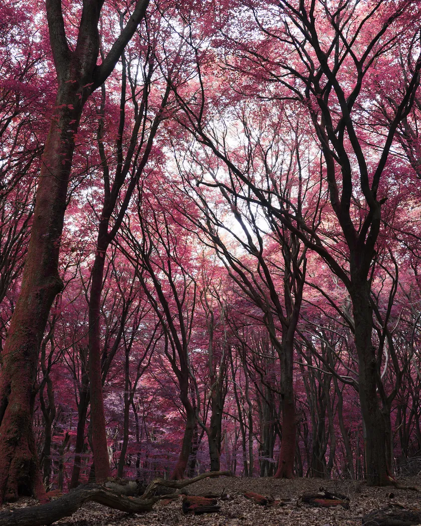
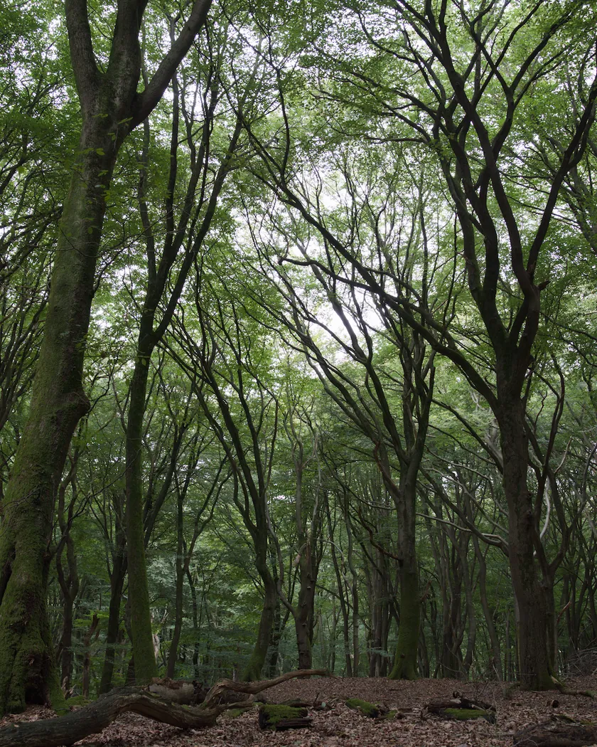
Translation into darktable
| Module | Role | Settings |
|---|---|---|
| color equalizer | Turns greens toward red-magenta, yellow-greens toward orange-red, and pulls cyan and blue toward a darker blue | Green: hue −180°, saturation ×1.2; yellow: hue −75°; cyan: hue +20°, brightness ×0.7; blue: brightness ×0.5, saturation ×1.1 |
| color balance rgb (instance “film”) | Midnight-blue shadows to match the darkened sky and water, strong saturation | Shadows 255° / 0.03; saturation +5 %, vibrance +0.08 |
| tone curve (RGB, per channel) | Steep curve: deep blacks, short shoulder; deliberately gentler than the datasheet curves | Nodes (0, 0) (0.1, 0.07) (0.25, 0.21) (0.5, 0.5) (0.75, 0.80) (0.9, 0.93) (1, 1) |
| grain | Fine grain, a little more present than the Portra 160 style, matching an rms granularity of 23 | Coarseness 1200, strength 16, midtones bias 80 |
Measurements
The measurements come from a few test photos of our own, which are not published on this site. The photos shown here are different.
| Photo | Zone | Baseline | Metric | Before | After | Film expectation |
|---|---|---|---|---|---|---|
| 0775 | whole image | Base rendering | L (lightness) | 53.2 | 42.9 | Darker blues (blue blocked by the filter) |
| 0775 | whole image | Base rendering | Lsd (contrast) | 14.3 | 16.7 | High contrast, steep curves |
| 1014 | whole image | Base rendering | Lsd (contrast) | 30.7 | 33.4 | High contrast, steep curves |
| 0775 | sky | Base rendering | L (lightness) | 55.3 | 42.2 | Deep cobalt sky |
| 0775 | sky | Base rendering | C (chroma) | 27.5 | 37.1 | Deep cobalt sky, strong saturation |
| 0775 | sky | Base rendering | h (hue, °) | 273.6 | 266.4 | Sky stays blue |
| 0775 | sea | Base rendering | L (lightness) | 38.4 | 25.8 | Water near black |
| 0775 | sea | Base rendering | h (hue, °) | 270.1 | 265.9 | Water dark blue |
| 0989 | skin | Base rendering | C (chroma) | 16.4 | 17.4 | Skin tones not much affected (35mmc) |
| 0989 | skin | Base rendering | h (hue, °) | 44.2 | 49.2 | Skin tones not much affected (35mmc) |
| 1014 | pink T-shirt | Base rendering | h (hue, °) | 358.8 | 356.9 | Reds left alone by design |
Base rendering: darktable’s default processing of the RAW file, without the preset. Luminance conversion (black and white): the same photo converted with plain luminance weights, to isolate the effect of the film’s spectral sensitivity.
What the style changes
The style sets four darktable modules. It is an interpretation of Kodak Aerochrome III 1443, a discontinued infrared film; the film itself is described on the Aerochrome III film page. All figures below come from renders made with darktable-cli 5.6.0 at 1000 px, measured in CIELab. No reference render from another product was available.
- A digital photo has no infrared. The style cannot tell which surfaces reflect infrared. It assumes green areas are vegetation and rotates them toward red-magenta. A green plastic lawn or green paint turns red as well, which the real film would not do.
- Model. The style works by hue, not by the film’s channel matrix. Greens turn toward red-magenta, yellow-greens toward orange-red, cyan slides toward blue and darkens, and blue is darkened strongly because the filter blocks blue on the film. Skin and warm tones are left in place.
- A rejected first attempt. An earlier version used rgb primaries (green −1.6 to −1.9 rad). The matrix also rotated yellows and oranges: skin turned cyan (hue 188°) and the sky black or violet. It was replaced by color equalizer, which isolates hues.
- Test photos. The sky gets darker (L 55.3 → 42.2) and more saturated (C 27.5 → 37.1) with its hue almost unchanged (273.6° → 266.4°), matching the “deep cobalt” reviewers describe. The sea drops from L 38.4 to 25.8 with the hue kept (270.1° → 265.9°). Photo 0775 as a whole goes from L 53.2 to 42.9. Skin stays put (hue 44.2° → 49.2°, C 16.4 → 17.4).
- A synthetic sRGB chart, because the test photos contain almost no vegetation (hue in degrees, before → after):
- olive foliage 118 → 20, grass 135 → 335, bright green 141 → 329: greens turn red-magenta, olive turns orange-red;
- sky 274 → 270 and deep blue 297 → 296, with lightness L 61.3 → 44.4 and 30.4 → 10.4;
- cyan 206 → 243 with L 70.8 → 62.5;
- yellow 97 → 89, red 34 → 36, skin 55 → 61: nearly unchanged;
- mid gray stays neutral (C 1.2 after).
- Steep curve, midnight shadows. A per-channel tone curve gives deeper blacks and a short shoulder. Contrast rises (Lsd 14.3 → 16.7 on photo 0775 and 30.7 → 33.4 on photo 1014). A color balance rgb instance named “film” tints shadows blue and adds saturation.
- Grain. Coarseness 1200 and strength 16 give a fine grain a little more present than the Portra 160 style, in line with the datasheet’s rms granularity of 23. That number is not comparable to a negative film’s rms figure.
What it leaves alone
- Your base development. The style contains no exposure, no sigmoid or filmic, no white balance, no LUT. Those settings stay as you made them.
- Your color balance rgb. The style’s color balance rgb is a separate instance named “film”, added next to yours.
- But not your color equalizer, tone curve or grain. When you apply a style from the lighttable or the darkroom, each of its modules replaces the instance of the same name if the photo has one, and is added otherwise. These three modules carry no instance name, so they replace any settings you had already made in them. Your earlier settings remain in the history.
- Your pipeline order. The style file carries no module order list.
Exporting with a style, or rendering with darktable-cli, works differently: every module of the style is added as a separate instance. Our measurements were made that way, on darktable’s default rendering. Details are in Install and apply darktable styles.
Limits
- No infrared in the image. Everything is guessed from green hue. A dark green leaf and a green sign turn the same red.
- Reds are unchanged. On the film, red prints green (datasheet). The style does not do this, to protect skin, which sits in the same hue family. A saturated red (a pink T-shirt, a vest) keeps its color.
- Blue is dark, not black. The filter blocks blue on the film; here the sky is deep blue, not black, and the sea reaches “near black” only halfway (L 38 → 26). An overcast sky, white on the film, stays gray.
- One filter, fixed. Reviews say the look depends on the filter (yellow, orange or red); the style fixes an intermediate look.
- Softer contrast than the datasheet. The datasheet curves are extremely steep; the style is deliberately gentler.
- Foliage checked on the chart only. The test photos show the effect mostly on the sky; foliage was verified on the synthetic chart.
- Grain is an estimate from the rms 23 figure, not a match.
Tips
- Apply it early. If you plan to fine-tune the color equalizer, tone curve or grain yourself, apply the style first: it would replace those settings if you made them before.
- Choose scenes with green foliage and blue sky. Those are the areas the style acts on.
- Installation: see Install and apply darktable styles.
Get the preset
GA — 061 / P · darktable preset
Aerochrome III 1443
for darktable