LomographyLomoChrome Purple
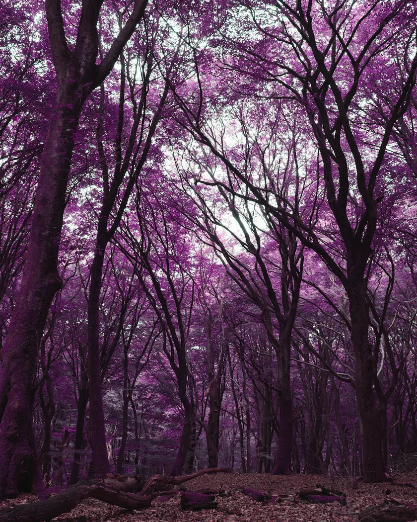
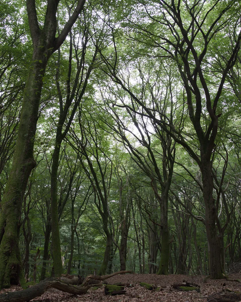
False color: greens turn purple, blues green or teal, yellows pink; reds stay red (Lomography)
- Manufacturer
- Lomography
- ISO
- 100-400
- Type
- Effects
- Process
- C-41
- Formats
- 135, 120, 110
- Status
- In production
- Datasheet
- None published
- Preset
- GA — 026 / P
Status checked [1]
Character
- Contrast
- No curve published; shadows 'kind of muddy' at ISO 400 for one user
- Grain
- Visible, like a typical ISO 400 color film (Analog.cafe); stronger in the shadows
- Latitude
- Wide ('XR', extended range); rating between 100 and 400 changes the effect
- Best for
- Foliage and sunny landscapes; portraits turn out flattering rather than natural
LomoChrome Purple is a Lomography color negative film for standard C-41 processing that shifts colors on purpose: in Lomography’s words, “blue becomes green, green becomes purple and yellow becomes pink”, while red tones stay red [1]. It is sold as ISO 100–400 in 35 mm, 120 and 110 [1] [4]. It is not an infrared film, although Lomography launched it in 2013 to evoke the look of Kodak Aerochrome infrared film [7] [5].
Look and color
Lomography publishes no data on how the film shifts colors. The descriptions below come from reviews, and they do not always agree.
- Greens turn purple. Analog.cafe finds that most greens come out in the same hue, though “cool and bright green shades will remain green” [4]. On overcast days, foliage can become “a dark and ugly mess” [5].
- Blues turn teal, turquoise or green. Skies come out “light cyan or teal” [5], turquoise [6] [10], “aqua/green” [8] or plainly green [7]. Analog.cafe says blues “drift slightly towards the green” [4].
- Yellows and oranges turn pink. Oranges, reds and even yellows are “rendered as pinkish-red” [4]; a yellow buoy turns pink and golden sand purple [7].
- Reds mostly stay red. Lomography says so [1]. Richard Haw noted a slight drop in saturation and red seats turning brownish [5]; FilmProcessing.co.uk saw some reds shift to orange [10].
- Unexpected swaps. Pinks turn pale yellow [7] and purples turn green [4]. Whites stay white [5] [10].
- Skin: the sources disagree.
- Shadows and dim light show more purple [4] [8].
- Strong saturation. The Darkroom gives it the top saturation rating [3].
- The scan matters. Emulsive found the scanner settings had more influence on the final colors than any other factor [8].
Tonality
- No published curve. Lomography publishes no datasheet [4].
- Wide latitude. Lomography markets an extended range, “XR”, and Analog.cafe finds that it holds detail in shadows and highlights [4]. The Darkroom gives it the top latitude rating [3].
- The rating changes the effect, but reviewers disagree on the direction.
- The Darkroom: at ISO 100 greens become “a shiny purple”, at ISO 400 “a darker indigo” [3].
- Casual Photophile: at 400, darker and bluer purples; at 200, pinker tones and turquoise skies [6].
- Matt Murray: at 400, more intense reds and purples and a greener sky; at 100, a paler, more muted version [7].
- Analog.cafe: rated at 400, stronger purples; rated at 100, lighter teal hues [4].
- Shadows. A Darkroom user found them “kind of muddy”, especially at ISO 400 [3]. Emulsive found results grainy when pushed beyond EI 400 [8].
- Hotspots. Richard Haw saw a bright spot in the center of some sunny frames, as on infrared film, but found no infrared sensitivity in a test and advises keeping the sun off the front of the lens [5].
Grain and sharpness
No granularity figure is published [4].
- Manufacturer and reviews disagree. Lomography promises “fine grain” [1]. Analog.cafe finds it “grainy but not any more than you’d expect from a typical colour ISO 400 film”, with sharp grain [4]. Richard Haw calls it “by no means a fine-grain film”, more visible in the shadows [5], and Chris Chinnock “most definitely not a smooth film” [9].
- Sharpness. Chris Chinnock finds it resolves a lot of detail, especially in the highlights [9].
Specs
| Item | Value | Source |
|---|---|---|
| ISO speed | 100–400 | [1] |
| Process | Standard C-41 | [1] |
| 35 mm roll | 36 exposures, no DX code | [1] |
| Current formula | 2021 'Pétillant'; tiny black dots may show in light areas, depending on the scanner | [1] |
| Datasheet | None published: no curves, no granularity, no spectral sensitivity | [4] |
Names, status and history
- 2013 launch. Lomography announced LomoChrome Purple in January 2013 as “a color negative film that yields infrared results”, with the first rolls shipped in July 2013 [7], in 35 mm and 120 [6]. Kodak Aerochrome had been discontinued in 2011 [7].
- Reformulations. In 2017 Lomography announced a new emulsion with more red sensitivity, better exposure at ISO 400 and less grain; boxes later read “New 2019 formula”, sold with the same promises [7]. Casual Photophile describes the 2019 version as “even more saturated” with stronger magenta [6].
- 2021 Pétillant. The current product is the “2021 LomoChrome Purple Pétillant”, which Lomography says may add “a sparkling surprise on some frames” and tiny black dots in light areas [1]. Analog.cafe lists it in 35 mm, 120 and 110 [4].
- Names. Reviews also call it “LomoChrome Purple XR 100–400”, the extended-range name [4] [5].
- Where it is made. Lomography does not say who coats it. Matt Murray found 2013 boxes marked “Made in Europe” or “Made in China”, and 2019-formula boxes “Made in China” [7].
- Status. On September 29, 2026, Lomography listed the 35 mm and 120 versions [1] [2].
Alternatives
- GA — 039 LomoChrome Turquoise
Lomography's other color-shift film; harder on skin tones, per two reviews
- GA — 040 LomoChrome Metropolis
Same ISO 100–400 range, but desaturated with punchy contrast instead of shifted colors
- GA — 061 Kodak Aerochrome III 1443
The discontinued false-color infrared film whose look LomoChrome Purple was launched to evoke
Get the look in darktable
The GA — 026 / P preset, inspired by LomoChrome Purple, is a darktable 5.6 style of 5 native modules, with no LUT. It sits on top of your own exposure and tone mapping.
| Zone | Metric | Before → after |
|---|---|---|
| sky | h (hue, °) | 273.6 → 177.8 |
| sea | h (hue, °) | 270.1 → 181.4 |
| skin | h (hue, °) | 44.2 → 18.3 |
Settings, all measurements and limits of the LomoChrome Purple preset
GA — 026 / P · darktable preset
LomoChrome Purple
for darktable
See real photos
Scans of real LomoChrome Purple film, published by others:
Questions about LomoChrome Purple
What is LomoChrome Purple?
A Lomography color negative film that shifts colors on purpose. In Lomography's words, 'blue becomes green, green becomes purple and yellow becomes pink', while reds stay red. It is sold as ISO 100–400, develops in standard C-41 at any lab, and comes in 35 mm, 120 and 110. The current version is the 2021 'Pétillant' formula.
Is LomoChrome Purple infrared?
No. It is a regular color negative film, even though Lomography introduced it in 2013 as a film that 'yields infrared results' and its look recalls Kodak Aerochrome infrared film. Richard Haw saw a central hotspot on some sunny frames, typical of infrared film, but found no sign of infrared sensitivity when testing for it.
What ISO should I shoot LomoChrome Purple at?
Anything from 100 to 400, and the choice changes the look, though reviewers disagree how. For The Darkroom, ISO 100 gives shiny purple and ISO 400 darker indigo. For Casual Photophile, 400 gives darker, bluer purples and 200 pinker tones. Matt Murray found ISO 400 the most intense and ISO 100 paler.
How does LomoChrome Purple work?
Lomography does not publish how. The result behaves like a film whose dyes no longer match the colors that exposed them: Analog.cafe calls it a false-color film. Nearly all the reported shifts fit a simple swap of the green and blue channels, which is how the Grain Archive style reproduces it; that is our model, not a measurement.
Sources
- 1M Lomography: 2021 LomoChrome Purple Pétillant 35 mm ISO 100–400, product page Accessed September 29, 2026.
- 2M Lomography: 2021 LomoChrome Purple Pétillant 120 ISO 100–400, product page Accessed September 29, 2026.
- 3C The Darkroom: LomoChrome Purple film reviews and photos (July 1, 2019) Accessed September 29, 2026.
- 4C Analog.cafe: Lomography LomoChrome Purple XR film review (Dmitri, September 3, 2023, updated April 17, 2025) Accessed September 29, 2026.
- 5C Richard Haw: Review, Lomography LomoChrome Purple 100-400 (December 3, 2022) Accessed September 29, 2026.
- 6C Casual Photophile: Lomography LomoChrome Purple review (Danielle Wrobleski, June 13, 2022) Accessed September 29, 2026.
- 7C Matt Loves Cameras: LomoChrome Purple film review, Lomography's colour-shift classic (Matt Murray) Accessed September 29, 2026.
- 8C Emulsive: Purple nights on LomoChrome Purple (Pixels and Grain Collective, May 8, 2021) Accessed September 29, 2026.
- 9C Chris Chinnock: Lomography LomoChrome Purple review (May 16, 2021) Accessed September 29, 2026.
- 10C FilmProcessing.co.uk: LomoChrome Purple 35mm film review (December 3, 2025) Accessed September 29, 2026.
M: manufacturer · C: review or community