LomographyLomoChrome Metropolis
Muted, desaturated color with a heavy contrast; reds stay the strongest (Lomography)
- Manufacturer
- Lomography
- ISO
- 100-400
- Type
- Effects
- Process
- C-41
- Formats
- 135, 120, 110
- Status
- In production
- Datasheet
- Film Guide
- Preset
- GA — 040 / P
Status checked [2]
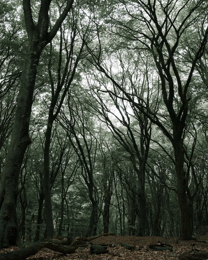
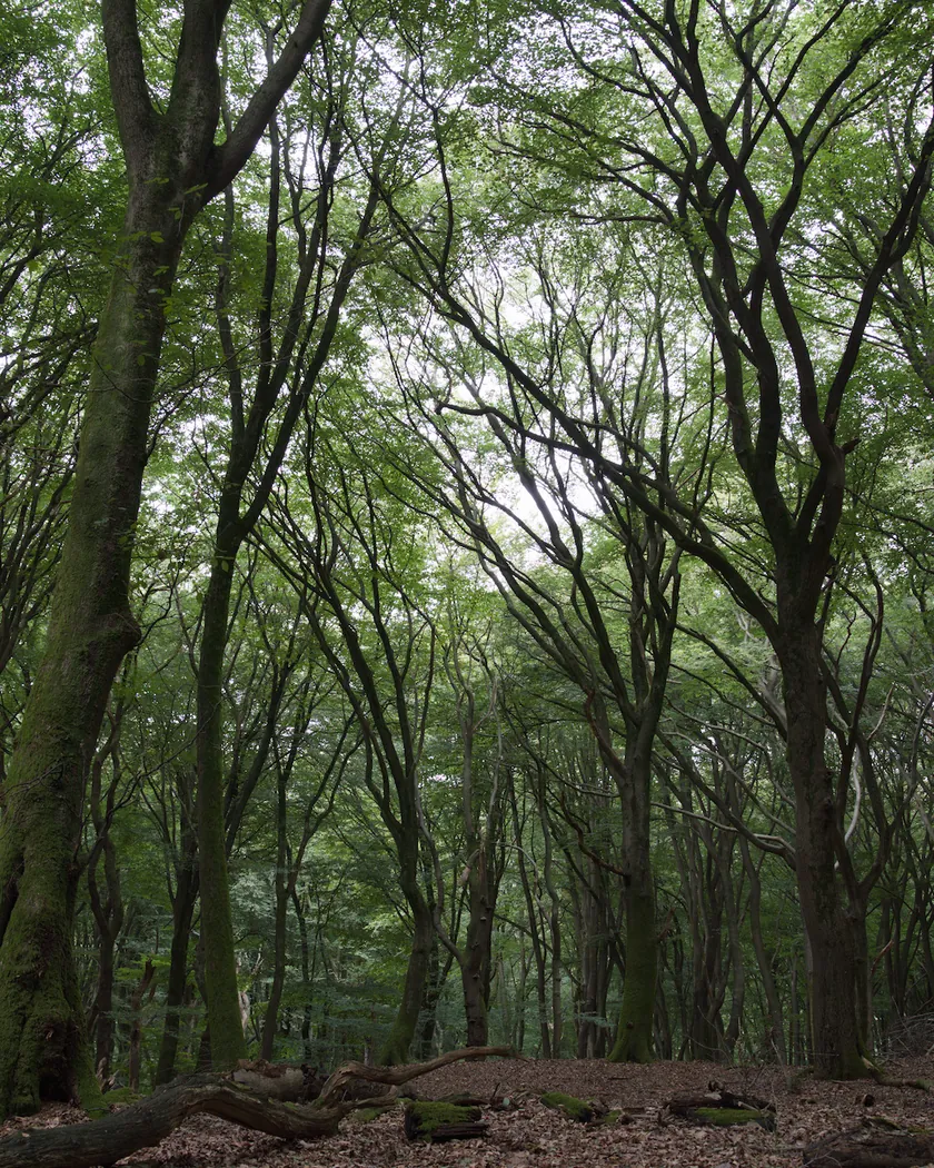
Character
- Contrast
- High: 'popping contrast' (Lomography), deep blacks in several reviews
- Grain
- Guide says 'fine cine-style'; three reviewers find it coarse, like ISO 400 black and white
- Latitude
- Forgiving; rating between ISO 100 and 400 changes the look
- Best for
- Bright sun, city and street scenes; flat and gray under overcast skies
LomoChrome Metropolis is a Lomography color negative film for standard C-41 processing, sold as ISO 100–400 in 35 mm, 120 and 110 [1]. Lomography describes it as the color-shifting master of muted tones and popping contrast [1]. Its palette is desaturated and its contrast high; it was funded through a 2019 Kickstarter campaign [3] [4].
Look and color
Lomography publishes no measurements, only a Film Guide with a color comparison image against a regular Lomography 100 negative. The descriptions below combine that guide with reviews, and they do not always agree.
- Muted color is the point. Lomography says to go “deep and dark in the shade” and “desaturated and dreamlike in the sunshine” [1]. On the guide’s comparison image, every patch looks duller than on the reference negative; the red is the strongest and the yellow the palest. That is a reading by eye, not a measurement. Reviewers agree on the low saturation: “desaturated colours” [3], and even at ISO 400 it “does not look as saturated as your usual daylight films” [5].
- Yellows suffer most. Richard Haw found the yellows subdued, with reds and greens affected less [5]. He also found the sky unattractive [5].
- Reds hold up. Lomography says the film “loves red tones” and suggests adding a splash of red to the frame [1].
- The color cast: the sources disagree.
- Green: Analog.cafe calls the developed film distinctly green [3], and Shoot It With Film notes a strong green bias [6].
- Warm: Emulsive saw a yellow tint, “almost sepia” at ISO 400 [4].
- Lomography does not mention a cast [1]. The scan can change a cast, so part of the disagreement may come from scanning.
- Skin is also disputed. Analog.cafe finds it “remarkably well-balanced” [3]. Haw found it bluish in direct sun, better in shade, and slightly better when underexposed [5].
- The rating changes the look. Emulsive found ISO 100 faded and sepia-like, ISO 200 a good middle ground and ISO 400 grungier and more desaturated [4].
- Weather. Shoot It With Film found it keeps more color in high sun and turns washed out on cloudy days [6].
Tonality
- No published curve. The Film Guide has no characteristic curve [1].
- High contrast. Lomography’s words are “popping contrast” [1]. Reviewers use “high contrast” [3] and “rich blacks and whites” [6]. Emulsive also found “good contrast” and deep blacks [4].
- Shadows. Lomography mentions “saturated shadows” [1] and suggests a fill flash, even outdoors, to open them up [1].
- Latitude. Haw calls it forgiving of exposure, with acceptable results even when heavily overexposed [5].
- Push and pull. According to the Film Guide, pushing (underexposing, then developing longer) raises contrast and grain, and pulling does the opposite. Because of the ISO 100–400 range, the pushed effect shows from ISO 800 to 1600 and the pulled effect at ISO 50 [1].
Grain and sharpness
No granularity figure is published [1].
- Manufacturer and reviews disagree. The Film Guide describes a “fine cine-style grain structure” [1], and Emulsive also found the grain fine [4]. Analog.cafe reports “severe grain” [3]. Haw calls it chunky, “almost like” ISO 400 black and white film, with limited sharpness [5]. Shoot It With Film saw substantial grain even in 120 [6].
- Sharpness. Analog.cafe found the contrast and sharpness high [3], while Haw found detail resolution limited [5].
Datasheet digest
| Item | Value | Source |
|---|---|---|
| ISO speed | 100–400 (extended range) | [1] |
| Process | C-41 | [1] |
| Push effect | Noticeable at ISO 800–1600 | [1] |
| Pull effect | Noticeable at ISO 50 | [1] |
| 35 mm roll | No DX code | [3] |
| Datasheet | Film Guide only: no curves, no granularity, no spectral sensitivity | [1] |
Names, status and history
- 2019 launch. Lomography funded the film through a Kickstarter campaign in 2019 and, according to Emulsive, shipped two months ahead of schedule, in December 2019 [4]. Analog.cafe presents it as a new emulsion rather than a repackaged stock [3].
- Names. Reviews call it “LomoChrome Metropolis XR 100–400”, the extended-range name [3] [4]. A limited “Tokyo Edition” in a metal tin was made with Kitamura Camera; Haw suspects it is the standard stock in special packaging [5].
- Formats. The Film Guide lists 35 mm, 120 and 110 [1]. Analog.cafe notes that 35 mm canisters have no DX code [3].
- Current version. Lomography’s shop lists a “2021 LomoChrome Metropolis” in 35 mm, ISO 100–400 [2]. We could not find what differs from the 2019 version.
- Status. On September 30, 2026, the 2021 35 mm version was listed by Lomography [2].
Also sold as
- LomoChrome Metropolis XR 100–400 (confirmed) [4]
Alternatives
- GA — 026 LomoChrome Purple
Same ISO 100–400 range and C-41 process, but it shifts colors instead of muting them
- GA — 039 LomoChrome Turquoise
Lomography's other color-shift film, with shifted hues rather than a desaturated palette
- Not on file Lomography Color Negative 100
The regular Lomography negative that the Film Guide uses as its color comparison reference
Get the look in darktable
The GA — 040 / P preset, inspired by LomoChrome Metropolis, is a darktable 5.6 style of 5 native modules, with no LUT. It sits on top of your own exposure and tone mapping.
| Zone | Metric | Before → after |
|---|---|---|
| sky | C (chroma) | 27.5 → 9.1 |
| sea | C (chroma) | 22.2 → 7.8 |
| skin | L (lightness) | 78.2 → 83.9 |
Settings, all measurements and limits of the LomoChrome Metropolis preset
GA — 040 / P · darktable preset
LomoChrome Metropolis
for darktable
See real photos
Scans of real LomoChrome Metropolis film, published by others:
Questions about LomoChrome Metropolis
What is LomoChrome Metropolis?
A Lomography color negative film for standard C-41 processing, sold as ISO 100–400 in 35 mm, 120 and 110. Lomography calls it the color-shifting master of muted tones and popping contrast. It was funded through a 2019 Kickstarter campaign. Colors come out muted and contrast high, with a grain that most reviewers call coarse. [1] [4]
What ISO should I shoot LomoChrome Metropolis at?
Anywhere from 100 to 400. Emulsive found ISO 100 faded and sepia-like, ISO 200 a middle ground and ISO 400 more desaturated and grungier. Lomography says pushing shows from ISO 800 to 1600 and pulling at ISO 50. [1] [4]
Does LomoChrome Metropolis have a green cast?
Reviewers disagree. Analog.cafe calls the developed film distinctly green and Shoot It With Film notes a strong green bias, while Emulsive saw a yellow tint, almost sepia at ISO 400. Lomography does not mention a cast. Scanner settings and exposure may explain part of the gap. [3] [4] [6]
Is LomoChrome Metropolis fine grained?
Lomography's Film Guide says it has a fine cine-style grain structure, and Emulsive also found it fine. Analog.cafe reports severe grain, Richard Haw calls it chunky, like ISO 400 black and white film, and Shoot It With Film saw substantial grain even in 120. No granularity figure is published. [1] [3] [4] [5] [6]
Sources
- 1DS Lomography: LomoChrome Metropolis ISO 100–400 Film Guide (2021)
- 2M Lomography: 2021 LomoChrome Metropolis 35 mm ISO 100–400, product page Accessed September 30, 2026.
- 3C Analog.cafe: LomoChrome Metropolis review (Dmitri, July 16, 2019, updated September 28, 2024) Accessed September 30, 2026.
- 4C Emulsive: Film stock review, LomoChrome Metropolis XR 100–400 in 35 mm and 120 (Maxime Evangelista, April 8, 2020, updated July 31, 2021) Accessed September 30, 2026.
- 5C Richard Haw: Review, Lomography LomoChrome Metropolis 100-400, Tokyo Edition (November 5, 2022) Accessed September 30, 2026.
- 6C Shoot It With Film: LomoChrome Metropolis film review (Samantha Stortecky, July 30, 2021) Accessed September 30, 2026.
DS: datasheet · M: manufacturer · C: review or community