darktable preset inspired by KodakVision3 250D
A lab scan of motion picture negative: long, flat curve, dense colors.
- Film
- GA — 013 · sheet, datasheet, sources
- Pack
- Full pack
- darktable
- 5.6 or later
- In darktable
- Styles › Pellicules › Cinéma
- File
- Pellicules - Cinéma - Kodak Vision3 250D.dtstyle
A darktable 5.6 style built from the Kodak Vision3 250D datasheet: native modules, no LUT, measured on real RAW files. In the full pack.
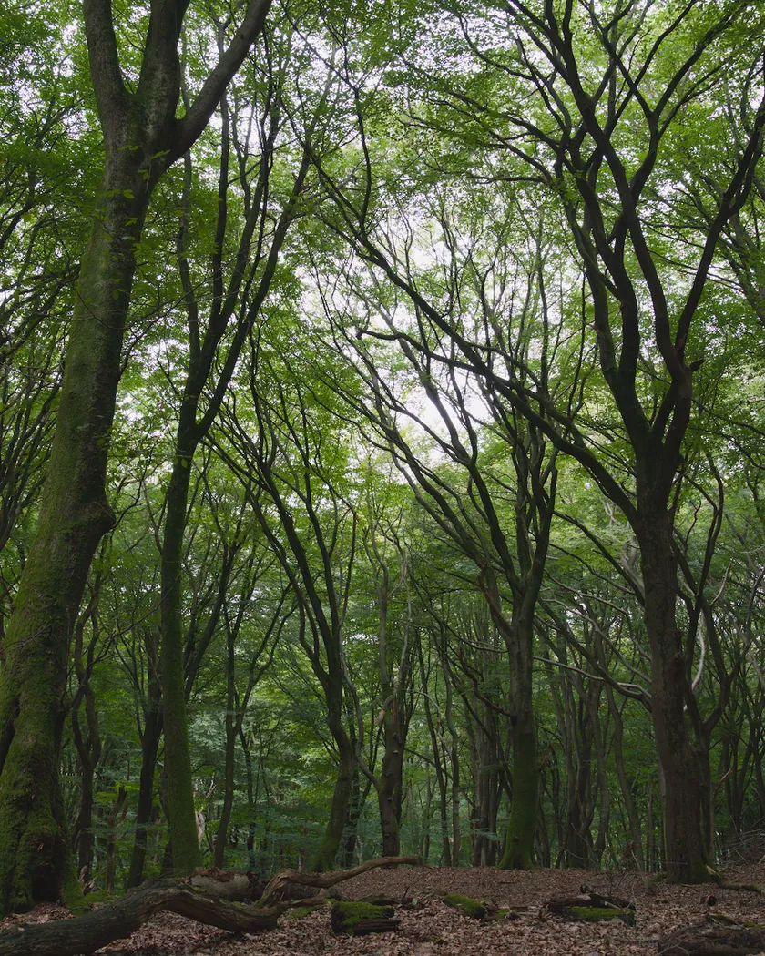
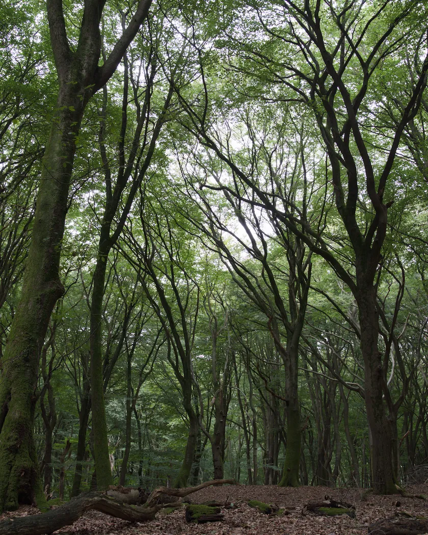
Translation into darktable
| Module | Role | Settings |
|---|---|---|
| rgb primaries | Slightly purer greens, with no hue rotation | Green purity 1.04 |
| color balance rgb (instance “film”) | Slight yellow warmth in the highlights, a faint green in the shadows, denser color | Highlights 65° / 0.012, shadows 130° / 0.012; saturation +6 %, shadow saturation +10 %, vibrance +0.05 |
| color equalizer | Stronger greens and blues, rich yellows and reds | Saturation: green +12 %, blue +10 %, yellow +6 %, red +4 % |
| tone curve (RGB, linked channels) | The flat curve of an ECN-2 scan: blacks lifted, middle gray unchanged, highlights held back | Nodes (0, 0.05) (0.10, 0.125) (0.25, 0.265) (0.5, 0.5) (0.75, 0.74) (0.9, 0.88) (1, 0.965) |
| grain | Very low granularity: finer than the Portra 400 style | Coarseness 1000, strength 10, midtones bias 90 |
Measurements
The measurements come from a few test photos of our own, which are not published on this site. The photos shown here are different.
| Photo | Zone | Baseline | Metric | Before | After | Film expectation |
|---|---|---|---|---|---|---|
| 1014 | whole image | Base rendering | Lsd (contrast) | 30.7 | 28.6 | Flat ECN-2 scan: lower contrast |
| 0775 | whole image | Base rendering | Lsd (contrast) | 14.3 | 13.5 | Flat ECN-2 scan: lower contrast |
| 1014 | whole image | Base rendering | L5 (blacks) | 2.6 | 6.8 | Lifted blacks |
| 1014 | whole image | Base rendering | L95 (whites) | 87.9 | 86.0 | Highlights held back |
| 0775 | sky | Base rendering | C (chroma) | 27.5 | 29.8 | Stronger blues than Portra |
| 0775 | sea | Base rendering | C (chroma) | 22.2 | 24.4 | Stronger blues than Portra |
| 0989 | skin | Base rendering | C (chroma) | 16.4 | 19.4 | Accurate skin, slightly denser |
| 0989 | skin | Base rendering | h (hue, °) | 44.2 | 45.8 | Skin hue almost unchanged |
| 1014 | pink T-shirt | Base rendering | C (chroma) | 33.7 | 36.5 | Rich reds |
| 1014 | white wall | Base rendering | b* | -0.8 | 1.0 | Warm scans: a slight cream |
Base rendering: darktable’s default processing of the RAW file, without the preset. Luminance conversion (black and white): the same photo converted with plain luminance weights, to isolate the effect of the film’s spectral sensitivity.
What the style changes
The style sets five darktable modules. It aims at what most still photographers see from this film: the lab scan of a negative developed in ECN-2. A print on Kodak 2383 print film would need another curve, which is not documented here. What the film is and how reviewers describe it is on the Kodak Vision3 250D film page. All figures below come from renders made with darktable-cli 5.6.0 at 1000 px, measured in CIELab.
- A flat, long curve. The tone curve lifts the blacks, keeps middle gray where it is and holds the highlights back. Contrast drops (Lsd 30.7 → 28.6 and 14.3 → 13.5), the darkest 5 % of the frame rise from L 2.6 to 6.8 and the brightest 5 % come down from 87.9 to 86.0. The curve acts on each channel without color preservation, and its nodes are in perceptual lightness: 0.5 is about middle gray.
- Dense color despite the flat curve. Flattening a curve also lowers saturation, so a color balance rgb instance named “film” adds saturation (+6 %, +10 % in the shadows) and a touch of vibrance.
- Stronger blues and greens. color equalizer raises green and blue saturation, and yellows and reds a little; rgb primaries makes greens slightly purer without turning them. Sky chroma rises from 27.5 to 29.8, sea chroma from 22.2 to 24.4, where the Portra 400 style lowers both by about 18 %.
- Accurate skin, rich reds. Skin hue barely moves (44.2° → 45.8°) while its chroma rises from 16.4 to 19.4; the Portra 400 style warms skin more (48.3°). A pink T-shirt gains chroma (33.7 → 36.5) without turning orange: its hue moves by 3°, against 10° with the Portra 400 style.
- Warm scans. The “film” instance adds a slight yellow warmth to the highlights: a white wall goes from b* −0.8 to +1.0, a slight cream.
- Very fine grain, finer than in the Portra 400 style, from Kodak’s “exceptionally low” granularity.
What it leaves alone
- Your base development. The style contains no exposure, no sigmoid or filmic, no white balance and no LUT. Those settings stay as you made them.
- Your color balance rgb. The style’s color balance rgb is a separate instance named “film”: it is added next to yours, which stays untouched.
- But not your rgb primaries, color equalizer, tone curve or grain. When you apply a style from the lighttable or the darkroom, each of its modules replaces the instance of the same module with the same name, if the photo has one, and is added otherwise. These four modules carry no instance name, so they replace any settings you had already made in them. Your earlier settings remain in the history.
- Your pipeline order. The style file carries no module order list, so it does not impose one on your image.
Exporting with a style, or rendering with darktable-cli, works differently: every module of the style is added as a separate instance. Our measurements were made that way, on darktable’s default rendering. The details are in Install and apply darktable styles.
Limits
- An interpretation, not a calibration. The style is built from Kodak’s datasheet and published reviews. No film was scanned or measured to tune it.
- The scanner decides. A scan depends on the lab and the scanner. Reviewers describe warm scans, but no scan settings are published.
- Conflicting sources. Reviews disagree on contrast (flat in ECN-2, contrasty in C-41 or without rem-jet), on saturation and on the shadow tint (green or magenta). The style follows ECN-2 and keeps the shadows almost neutral: its faint green only reduces the purple cast of darktable’s base rendering (a* 1.9 → 0.9 in one shadow).
- No 2383 print look and no halation. The film’s anti-halation layer prevents halos, so the style adds none.
- Greens not measured. The test photos have no green reference area.
- Subtle by design. The difference from the base rendering is mostly in the shadows and in the density of blues. The grain is almost invisible at 1000 px.
Tips
- For 250D developed in C-41, as sold by some respoolers, reviewers find more contrast than in ECN-2. The style aims at ECN-2: add contrast yourself afterwards, for example in the tone curve it sets.
- Apply it early. If you plan to fine-tune the tone curve, rgb primaries, color equalizer or grain yourself, apply the style first: it would replace those settings if you made them before.
- Installation: see Install and apply darktable styles.
Get the preset
GA — 013 / P · darktable preset
Vision3 250D
for darktable